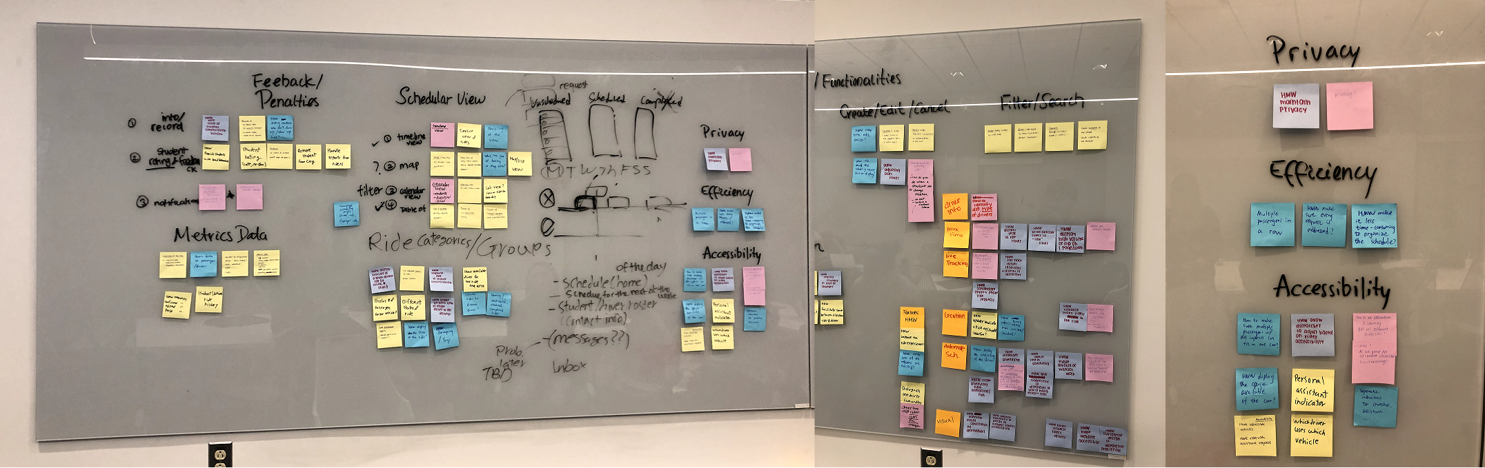
WorkAboutContact
Carriage, Locating Tracking
A new locations page, safe ride tracking system, and ride cards for admins and students.
Designed an intuitive locations page and interactive map for Cornell's ride service, streamlining tracking for 1,100+ monthly rides and managing locations for 300+ students with disabilities.
Overview
Carriage, a Cornell Digital Tech & Innovation project, improves campus mobility for ~300 students with disabilities, addressing the poor UX and restrictive policies of the outdated CULift system.
Impact
I designed Carriage’s locations page with real-time ride updates and management modals, shipped in Spring 2024 to help admins track rides more easily.
Role
Product Designer
Timeline
Feb - May 2024
Team
1 designer, 4 engineers, 1 PM
What are Carriage
and CULift at Cornell?
Carriage aims to improve the process of scheduling, completing, and monitoring CULift rides for all parties, thus improving Cornell’s accessibility for students with disabilities.
Cornell is not an easy campus to navigate with its steep hills and sprawling student residential area.

An accessibility solution does exist in the form of CULift, a paratransit pre-arranged shuttle program. However, the technical platform supporting CULift is outdated, resulting in a poor user experience on both sides and overly stringent constraints on CULift policies.
3 stakeholders involved
in the process
While Carriage is catered to students, there are multiple organizations working behind the scenes making sure the product is implemented, used, and maintained. These include...

01

CULift
Prearranged shuttle service for SDS-approved students. Servicing 300+ students with documented disabilities via 1100+ monthly rides.
02

SDS - Student Disability Services
Ensures that all aspects of Cornell student life are accessible, equitable, and inclusive of individuals with disabilities.

03

CIT - Cornell IT
Needs to sign off on all technical aspects of this project as they are the ones who will ultimately have ownership and maintain responsibilities.

Admins need to
manage the behind the scenes
Carriage serves students needing rides, drivers fulfilling rides, and admins managing the system.
For the purposes of the Locations page, I focused on designing for the admin user pool. This is because the only users with access to real-time updates regarding active rides are SDS and CULift admins monitoring them throughout the day.

"Let's find a way to see real-time updates while also updating our pick-up and drop-off locations." - CULift Admin

User research
findings & insights
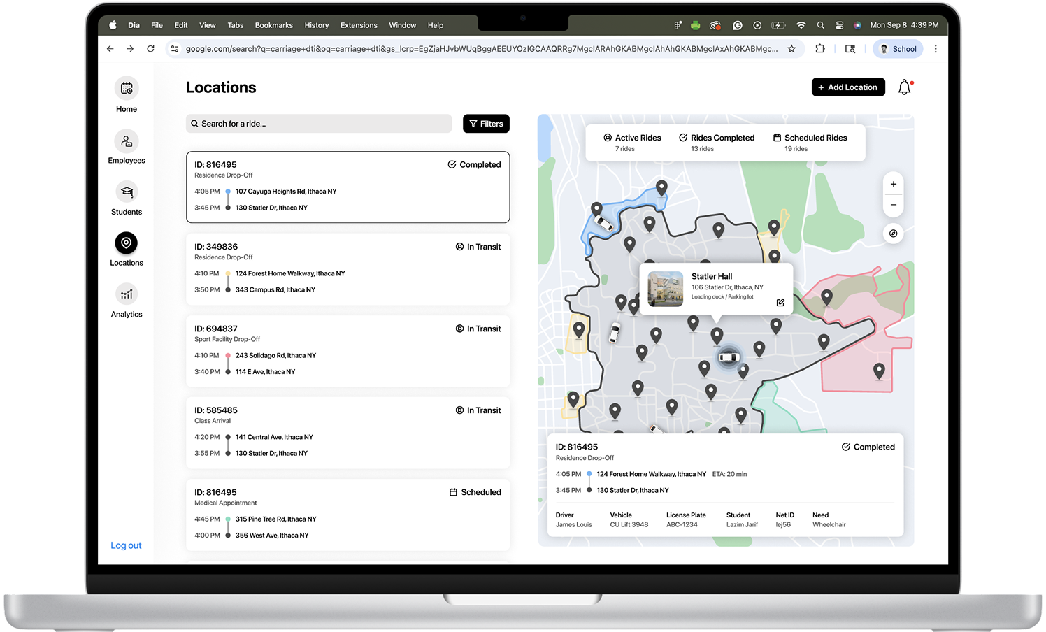
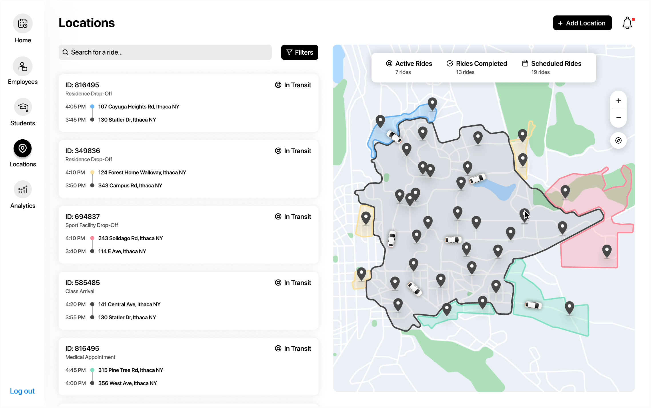
Currently, CULift has an inconvenient method of tracking rides across different coverage areas. The current system is divided into 4 separate parts:

(1) The CULift Service Program

(2) The CULift Service Radius Map

(3) The Locations List

(4) An Excel Spreadsheet

80%

Of admins experience ineffective communication
Riders use a difficult system and drivers rely on printed schedules, causing poor communication and missed updates on cancellations.
50%

Of admins are confused about the service radius map coverage areas
Locations are split by on-campus (red) or off-campus (yellow), but using the same yellow causes confusion and matching them to Excel coverage areas is tedious.
60%

Of admins find it tedious to search through the locations list and make updates
Admins struggle with a tedious and disorganized process, manually adding and updating locations in a long Excel list throughout the semester.

90%

Of admins find the Excel sheet method disorganized and time-consuming
Admins spend 4–8 hours daily manually scheduling employees in an error-prone, unorganized Excel spreadsheet.
Defining a product goal
Making it easier for admins.
With the Locations page, we made it our goal to provide an efficient and easy-to-use experience for admins to track rides throughout the day while also being able to update and add new locations.
Feature #1
Coverage Areas
Taking the original coverage area map, I designed a simplified map interface by assigning specific color categories to distinct coverage areas.
On-Campus CULift Coverage Area
Cayuga Heights Extension Coverage Area
CULift Limited Coverage Areas (3)
East Extension Coverage Area
Collegetown Extension Coverage Area (2)
These new color categories address the previous issue where admins could only distinguish coverage areas using red and yellow for “on-campus” and “off-campus,” making it easier to identify each zone at a glance.
This approach not only made the map easier for developers to implement without relying on a complex map API, but it also ensured the map was limited to the relevant coverage areas, simplifying the process for admins and enhancing overall development feasibility.
Design decisions
for locations, ride cards, markers, and page layout
As admins are dealing with information on the map locations throughout the day, I wanted to make these as easily accessible and convenient as possible. I looked at multiple different iterations making use of the existing map interface designed above.
Location Pop-Up Card
The admin can immediately associate the location to its coverage area with a pop-up.
Detailed Card
Admins may experience an information overload and this card design covers a large part of map.
Prioritizing ID + Pick Up & Drop Off
Admins can find priority information first here when verifying rides, and then look at secondary details.
Prioritizing Pick Up & Drop Off
Admins can see the pick-up and drop-off information on the left side panel, therefore unnecessary.
Zoomed in Map Preview
Having a zoomed-in map preview might deter the admin from more important details on the card.
Coverage Area Color-Coded Markers
Using different colors, the markers are accessible for those with color blindness as they pass WCAG AA and AAA compliance.
Single-Colored Pick Up & Drop Off Markers
Using the same color for pick up and drop off markers would cause confusion in terms of associating addresses to areas.
Right-Side Map
Most users read from left to right, making it intuitive to first scan the list of rides before focusing on the map details.
Left-Side Map
Complicates the user experience with a heavy focus on the map rather than the ride cards.
Car interaction
design & states
To distinguish a selected car from an unselected car on the map, I decided to design an in-motion selected state indicating to the user which car they are viewing.
Description of GIF
Description of GIF
Final designs
for ride location tracking & updating
Admins can now track rides throughout the day by viewing their actual map locations. They can also quickly search for specific rides, providing them with all the necessary details for verification purposes. Lastly, they can easily add new pinned locations to the map for better organization and management.
GIF from Medium
GIF from Medium
InstagramEmailLinkedIn
Lazim Jarif © 2025